Cobra Lily
Brand Identity
Packaging
Typography
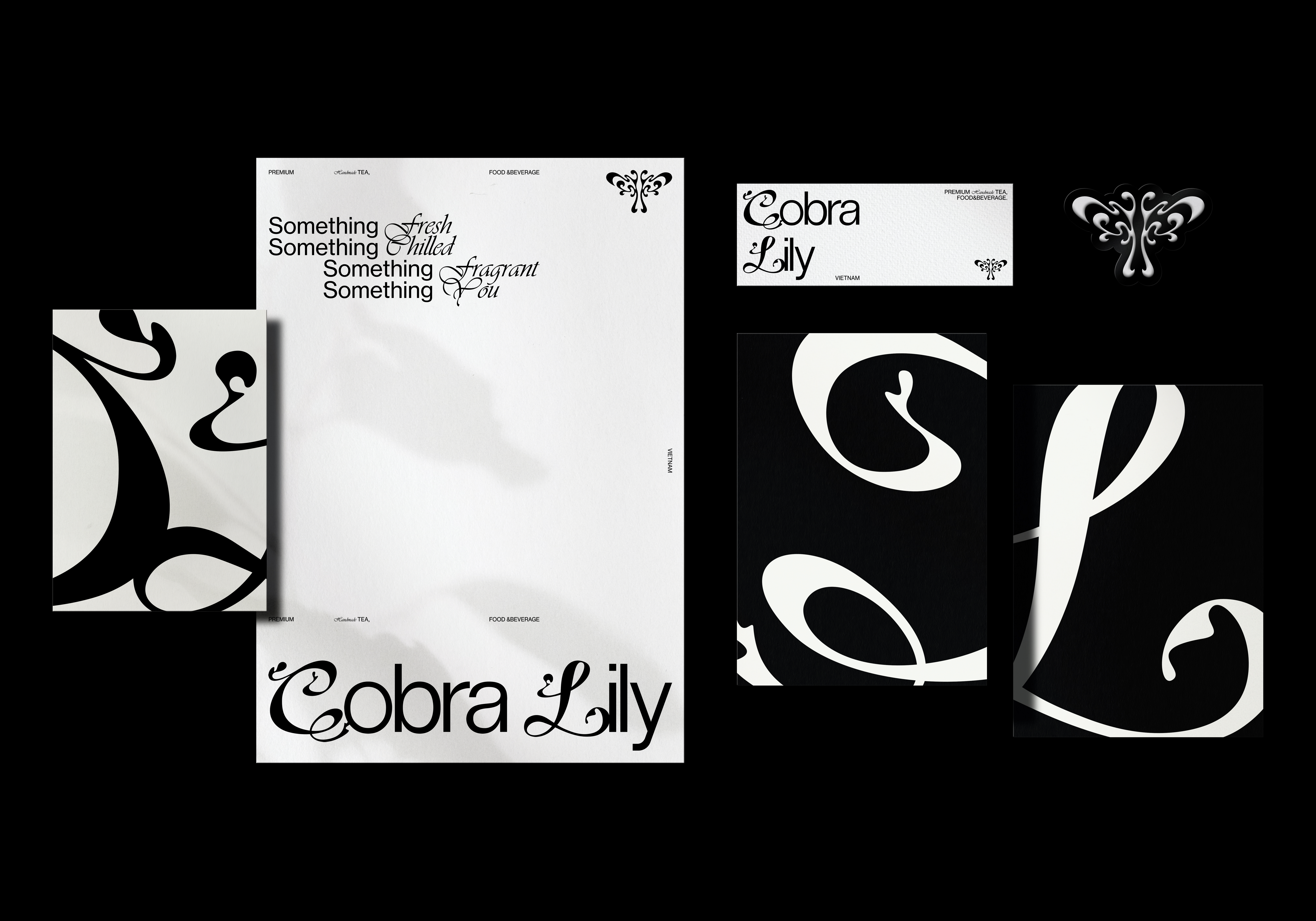
Cobra Lily is a beverage brand from Vietnam that provides high-quality handmade teas and flavorful meals. The beverages are made with high-end tea, combined with domestic characteristic fruits and fresh dairy products. The signature milk tea with rich milk cap has become one of the unique selling points of the brand.
The name of Cobra Lily comes from the founder's memories of traveling in Asia. After years of traveling in foreign countries and exposure to various food experiences, he hopes to bring the innovative beverage culture back to Vietnam.
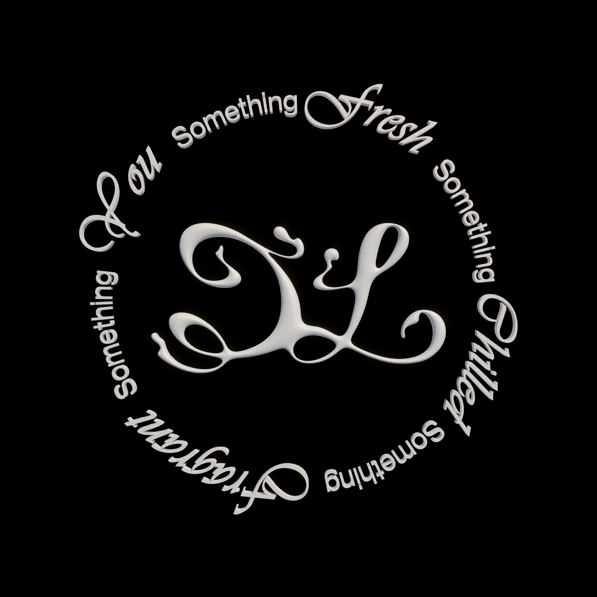
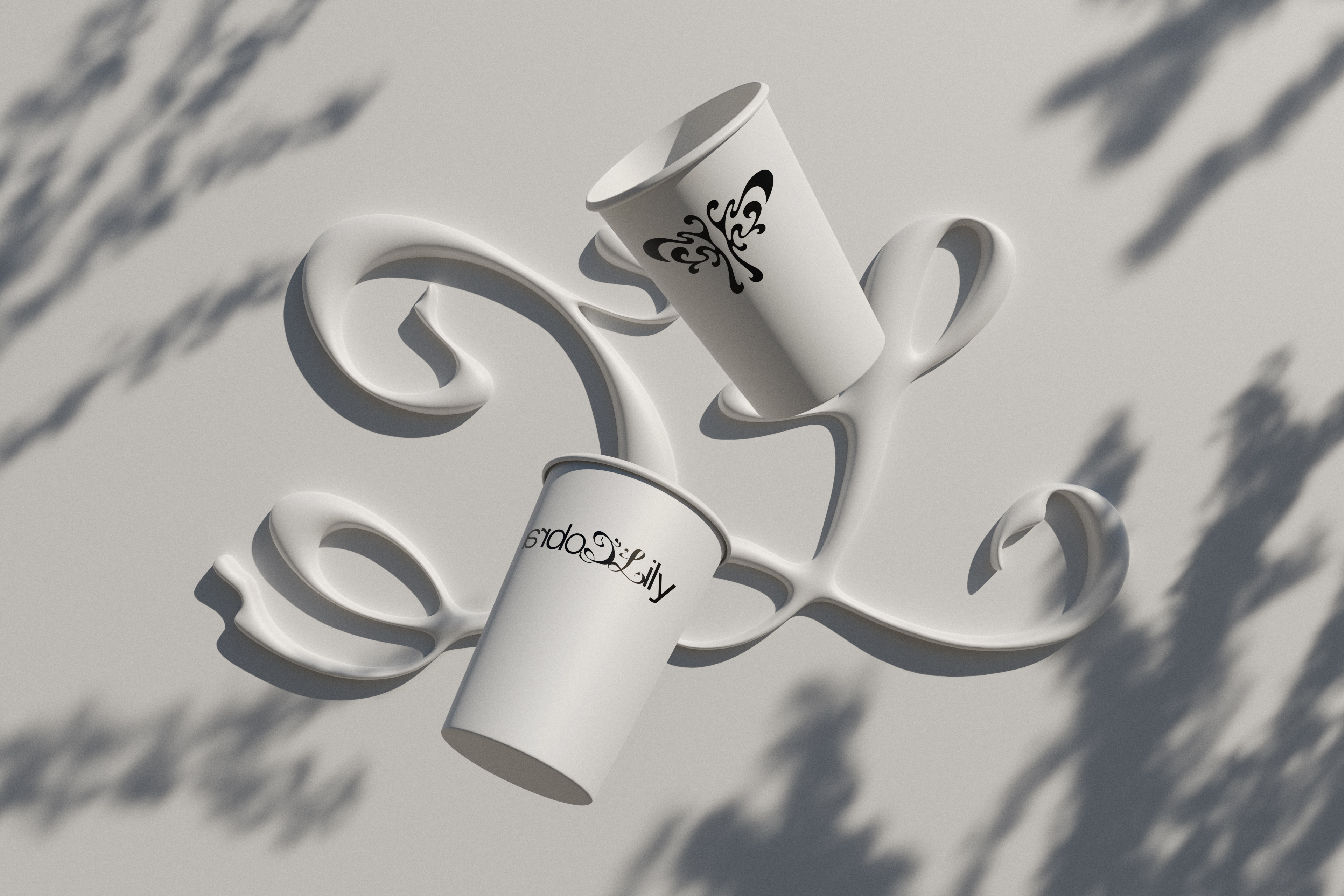
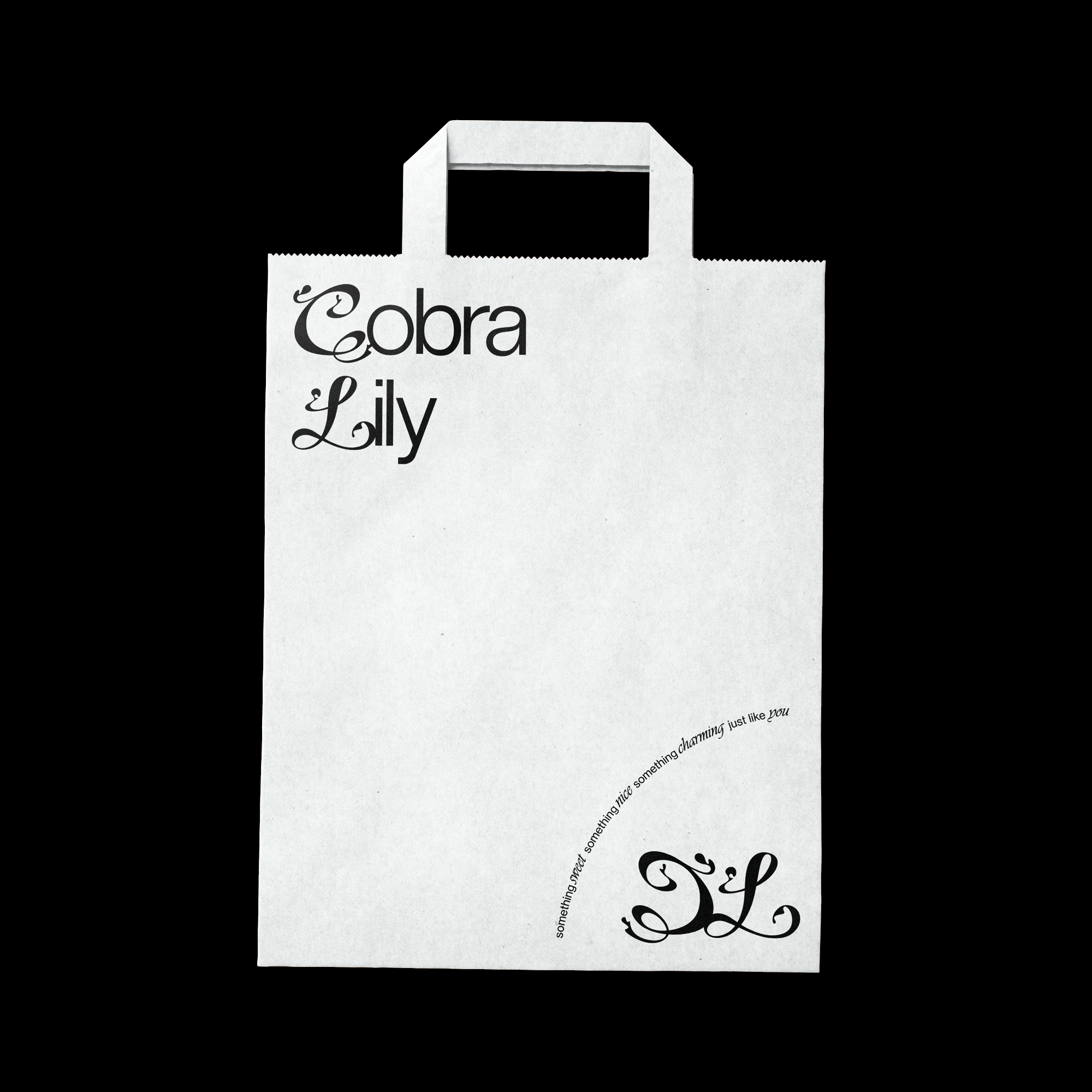
According to the concept of the brand, we used pure black and white tones as the base and focused on the shape and typography to create a post-modern style that is different from the general Asian tea brands. The logo and logotype incorporate plant-like organic lines, which form a strong contrast with the minimalist sans-serif font design. This collocation makes the visual image not too wild, but elegant simplicity, conveying a simple, plentiful image and unique atmosphere.
Cobra Lily是一間來自越南的飲料品牌,提供優質的手工茶飲與風味簡餐。產品運用高端的茶葉,結合國產特色水果及新鮮乳製品製作,招牌奶茶加上濃郁的奶蓋成為品牌最佳賣點之一。
Cobra Lily名源自於創辦人於亞洲旅遊的回憶,經過長年的異國巡禮及接觸各式飲食體驗後,希望能將創新的文化帶回越南手搖飲市場。
在深入了解理念後,我們以單純的黑白色調為基底,將重點著重於形狀及排版,塑造出較一般亞洲茶飲品牌不同的後現代風格。在標誌與標準字的形體上融入了植物般的有機線條,與極簡的黑體字形成強烈的碰撞,如此的搭配使畫面不過於張狂且優雅而直白,傳達簡單卻不失豐富的視覺形象及獨特的氛圍。