INKDUSTRIAL+
Brand Identity
Packaging
Typography
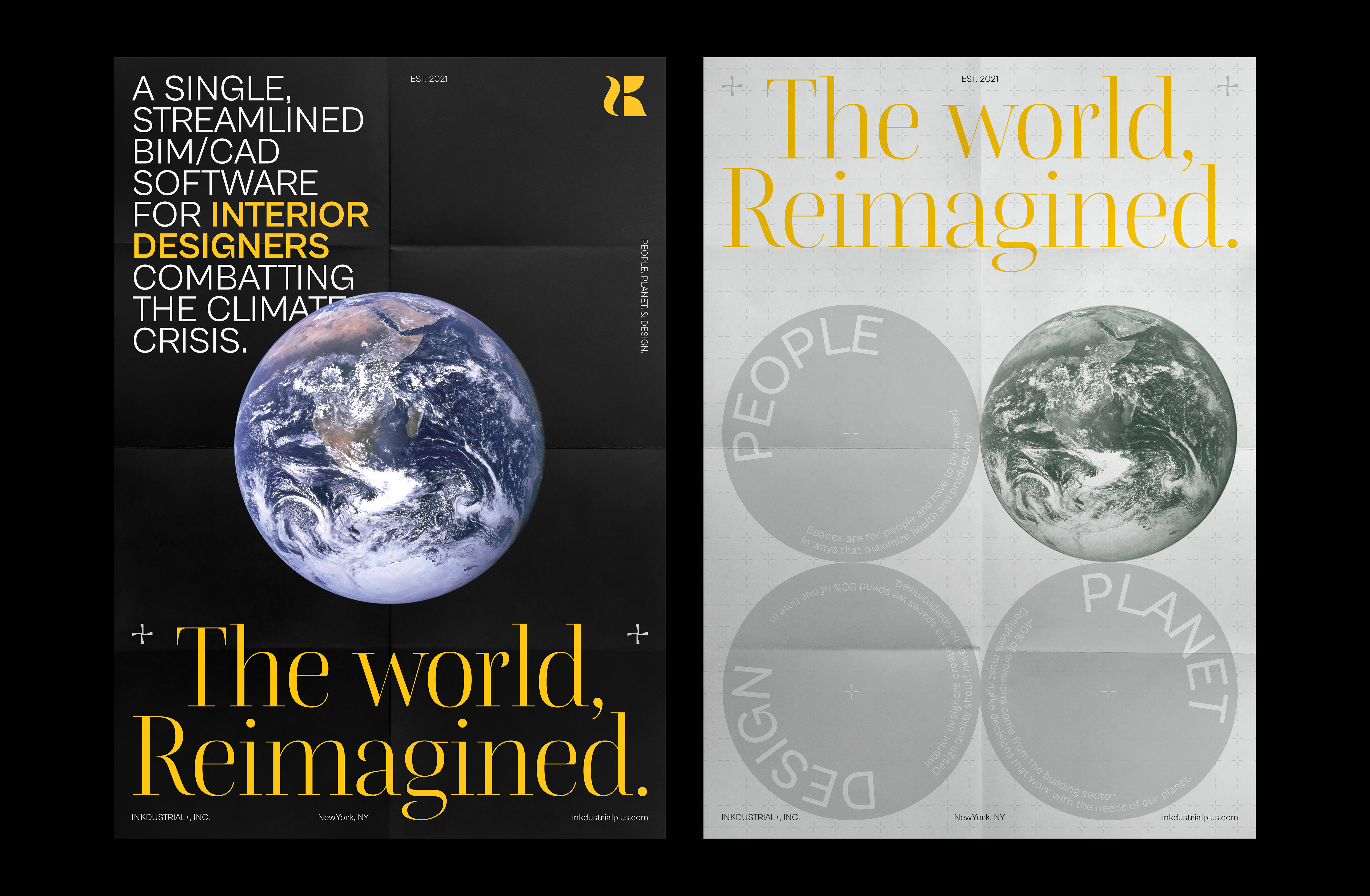
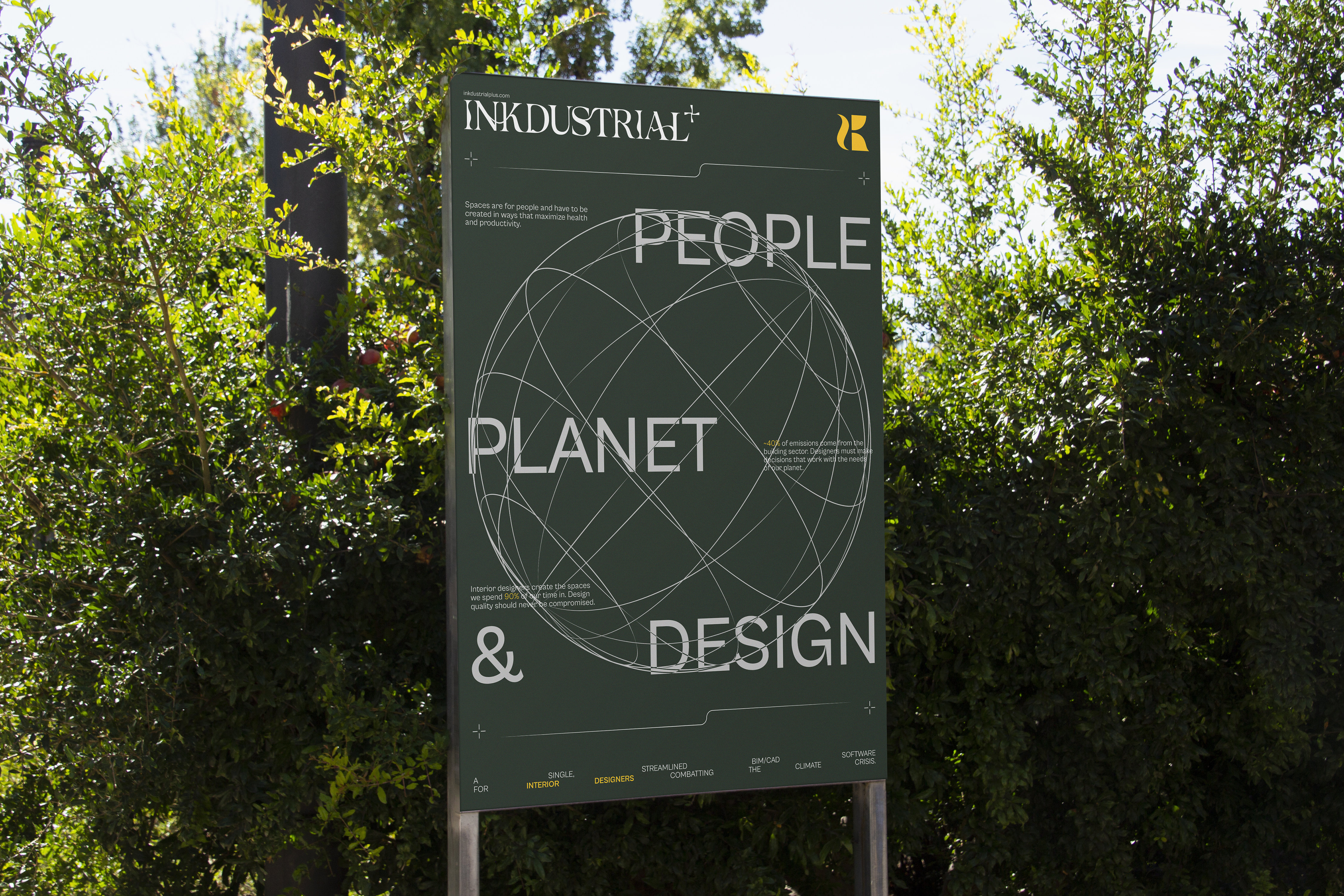
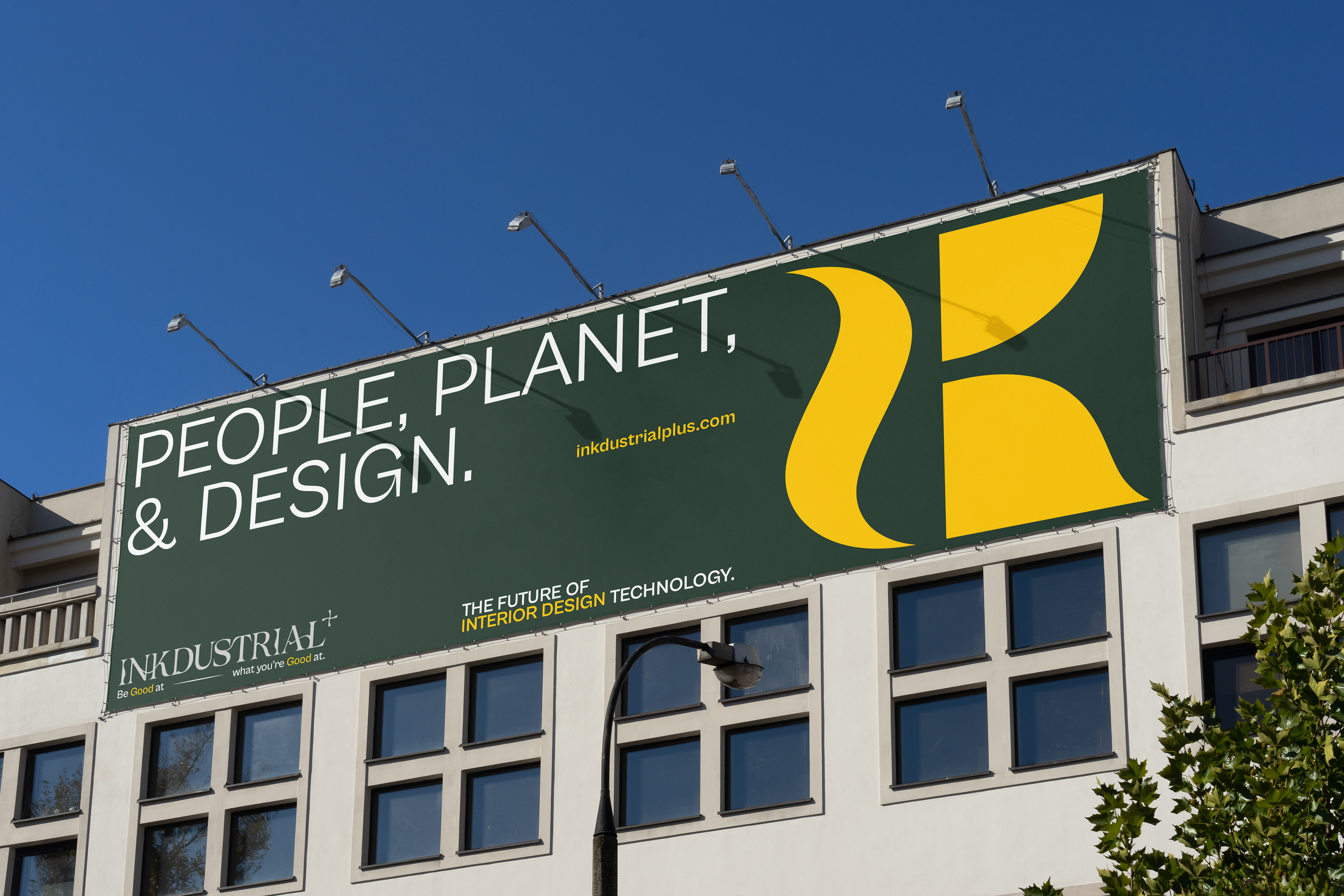
INKDUSTRIAL+ is a tech startup based in New York, USA that will launch a software of the same name in the future. The mission is to fuel interior designers on the road towards net zero by providing the tools to design sustainable and accessible spaces without exploiting time, money, and the planet’s resources. The brand’s philosophy lies on three pillars: people, planet, & design. Maximize productivity and health, reduce emissions from the building sector, lower time-consuming and complex procedures while maintaining design quality.
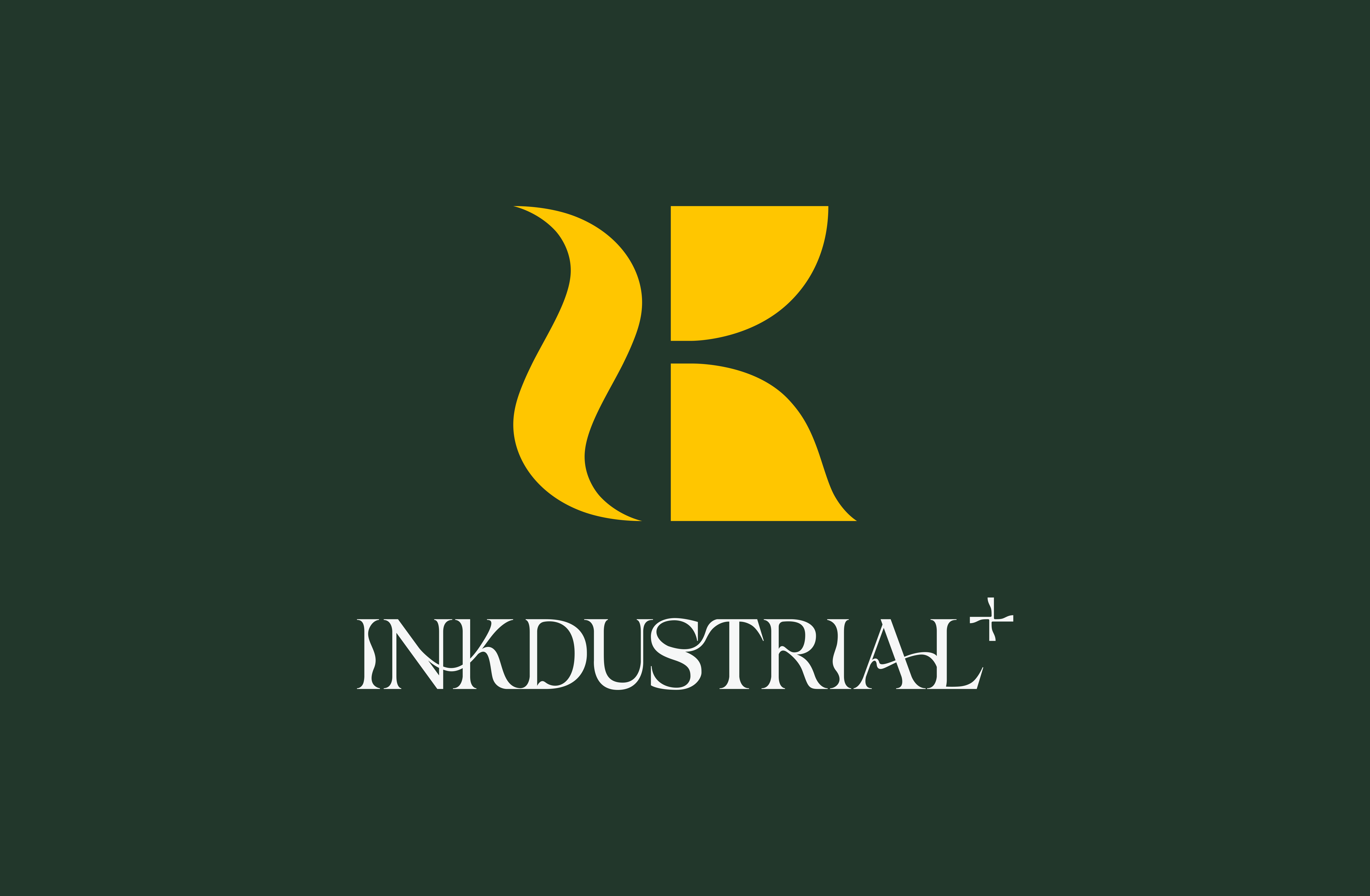
The brand name combines INK (Ink, Design draft), INDUSTRIAL (Engineering) and the “+” symbol, hoping to build software into a free space, transforming the design process from boring to energetic, improving the way industry interacts with real-time team collaboration. It is an innovative software with unlimited potential. Based on the brand essence, we hope to subvert the previous perception of interior design software and bring the humanities and cultures, sustainability and human welfare expressed by the brand into the visual.
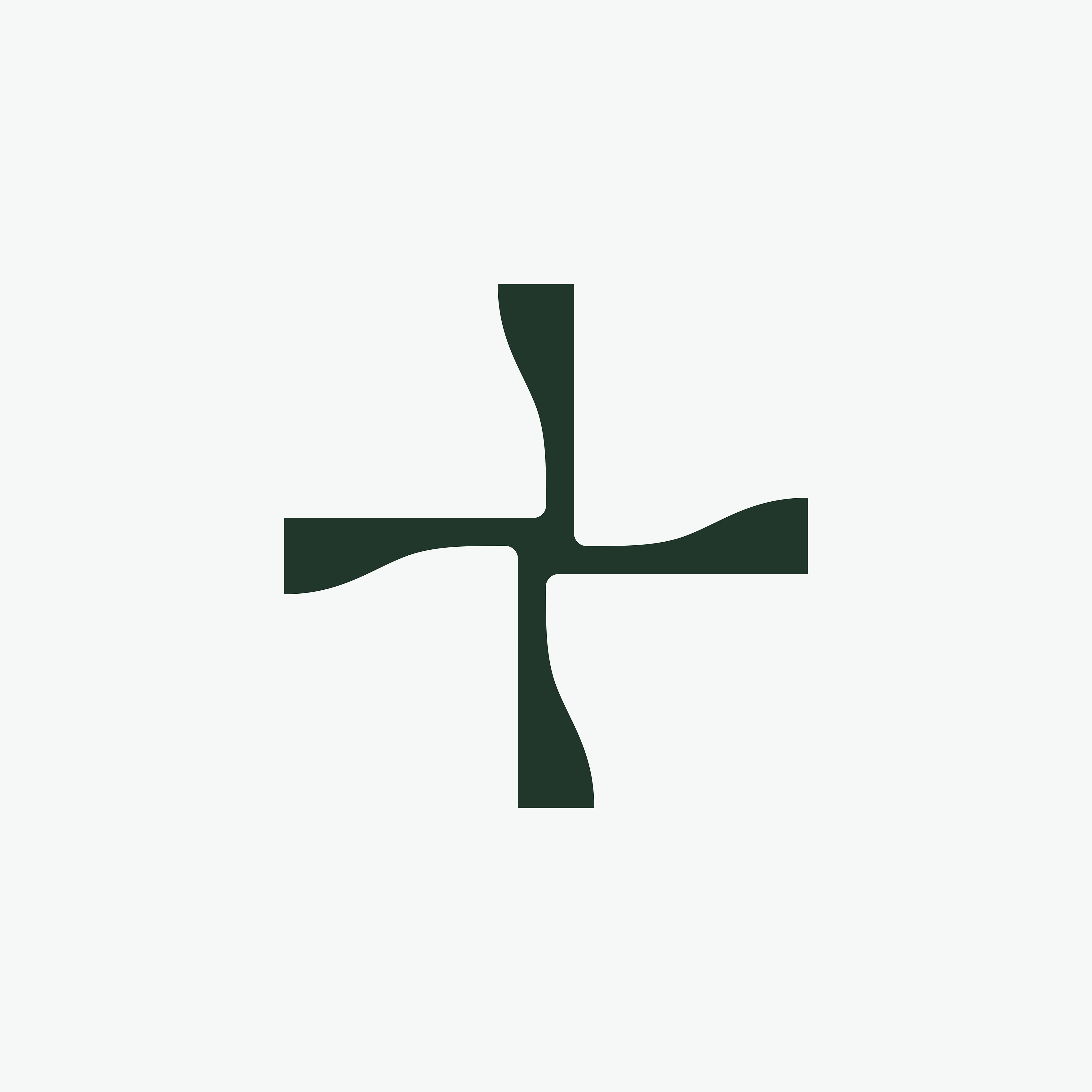
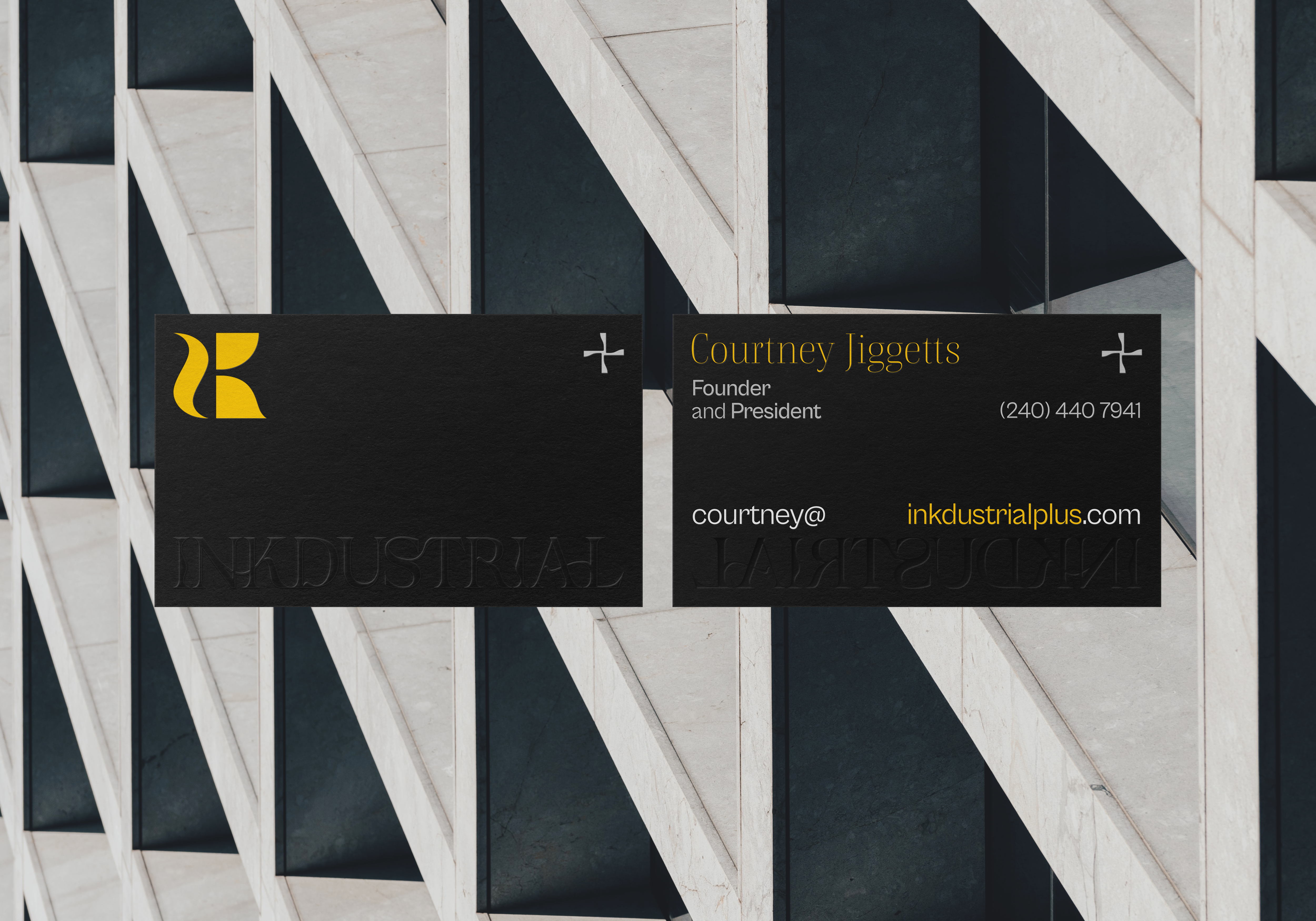
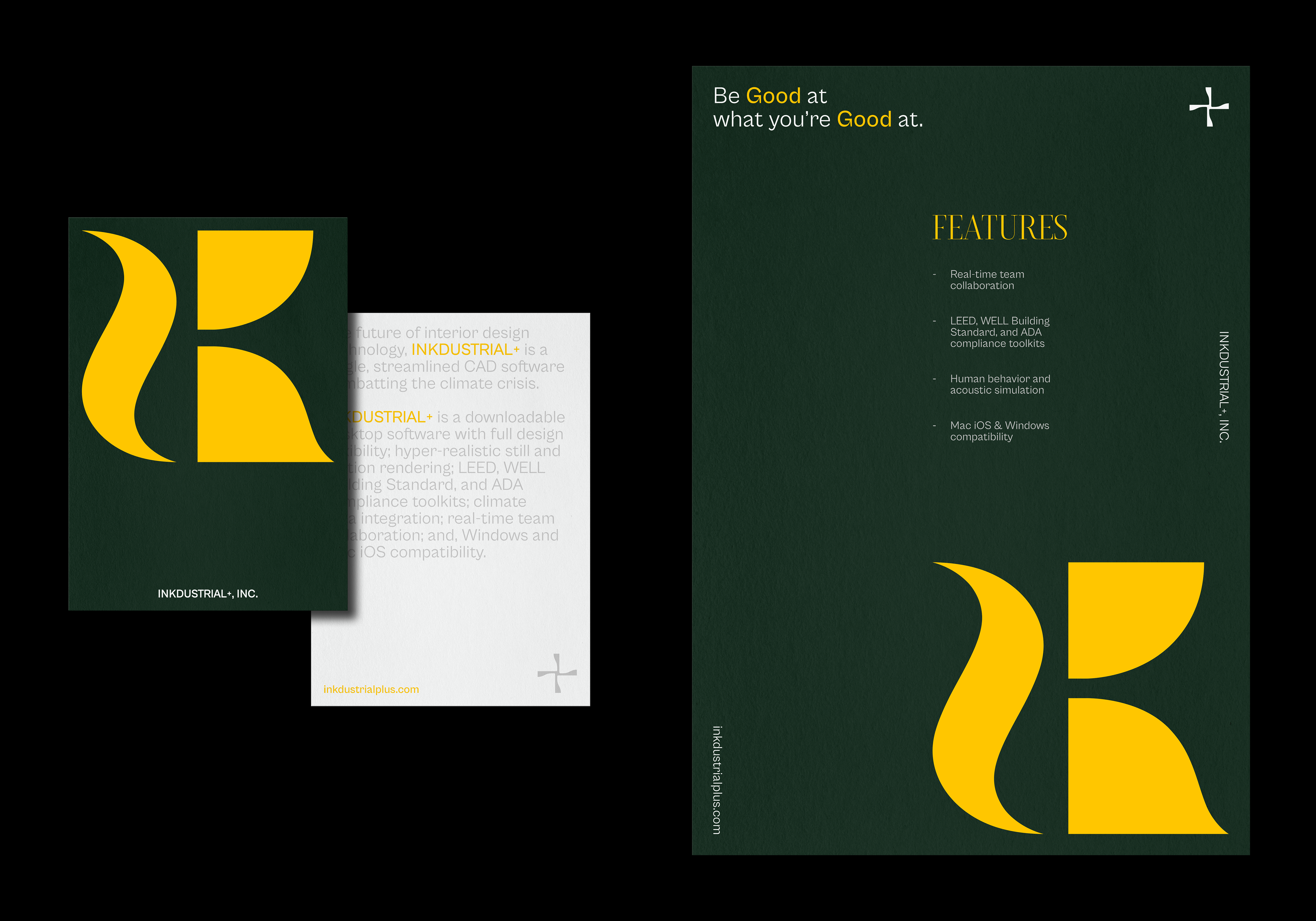
The brand logo is presented as an abstract geometric symbol, it can represent the three letters of “INK”, but also feel like composed of different objects. This visual presentation just like an interior designer organizing different objects in a smooth and not rigid way. In terms of the logotype, we combine the ink and lines of the brand concept to express the fluency of the software, and the combination with the curve makes people feel the humanistic atmosphere. In terms of the “+” symbol, we designed a logo with a shape that extends in all directions, and used it in the visual of different items to show the brand’s extensibility. The brand color is based on a neutral palette, consisting of green, yellow and grayscale. Yellow represents the concept of energy, while green represents sustainability.
Finally, in terms of graphic design, we organize the overall concept. The grid system layout and ink-like serifs brings out a distinct sense of elegance and professionalism, creating an inclusive and sustainable brand positioning.
The brand name combines INK (Ink, Design draft), INDUSTRIAL (Engineering) and the “+” symbol, hoping to build software into a free space, transforming the design process from boring to energetic, improving the way industry interacts with real-time team collaboration. It is an innovative software with unlimited potential. Based on the brand essence, we hope to subvert the previous perception of interior design software and bring the humanities and cultures, sustainability and human welfare expressed by the brand into the visual.
The brand logo is presented as an abstract geometric symbol, it can represent the three letters of “INK”, but also feel like composed of different objects. This visual presentation just like an interior designer organizing different objects in a smooth and not rigid way. In terms of the logotype, we combine the ink and lines of the brand concept to express the fluency of the software, and the combination with the curve makes people feel the humanistic atmosphere. In terms of the “+” symbol, we designed a logo with a shape that extends in all directions, and used it in the visual of different items to show the brand’s extensibility. The brand color is based on a neutral palette, consisting of green, yellow and grayscale. Yellow represents the concept of energy, while green represents sustainability.
Finally, in terms of graphic design, we organize the overall concept. The grid system layout and ink-like serifs brings out a distinct sense of elegance and professionalism, creating an inclusive and sustainable brand positioning.
INKDUSTRIAL+是一間來自美國紐約的新創科技公司,將於未來推出同名軟件。
其目的是為了讓室內設計師走向乾淨、不浪費時間及金錢、基於能源和地球資源而推出的革新軟件。品牌的宗旨基於三個要素-人類、地球及設計:以最大限度提高生產力和健康,降低建築行業的汙染排放,減少耗時且複雜的程序並同時維持設計的質量。
品牌名稱結合了INK(墨水、設計稿)及INDUSTRIAL(工程)和「+」符號,旨在於希望將軟體打造成一個自由揮灑的空間;將枯燥的設計過程轉換成充滿活力,以實時的團隊協作改善產業互動的方式,為一款革新且無限可能的設計軟件。基於品牌的調性,我們希望顛覆既往對室內設計軟體的認知,將品牌所表達的人文、可持續性和人類福祉帶入視覺中。
品牌標誌以抽象的幾何符號發揮,乍看之下可以代表「INK」三個字母,同時也能感覺是由不同的物件組成,如同室內設計師將不同的物件以流暢而不僵硬死板的方式組織起來。在標準字體上,我們結合了品牌概念的墨水及線條表達出軟體使用的行雲流水,與曲線的搭配使人感受到人文氛圍;在「+」的符號上,我們設計了形體往四方延展的標誌,並運用在各品項的視覺上,呈現出品牌的拓展性。品牌色基於中性的色板調配,以綠、黃和中性灰階組成,黃色代表著能源的概念,而綠色則代表永續。
最後,在圖形設計上,我們將整體的概念組織,網格系統的排版佐以如墨線般的襯線,帶出截然不同的雅緻和專業感,塑造出具包容、可持續性的品牌定位。