essence
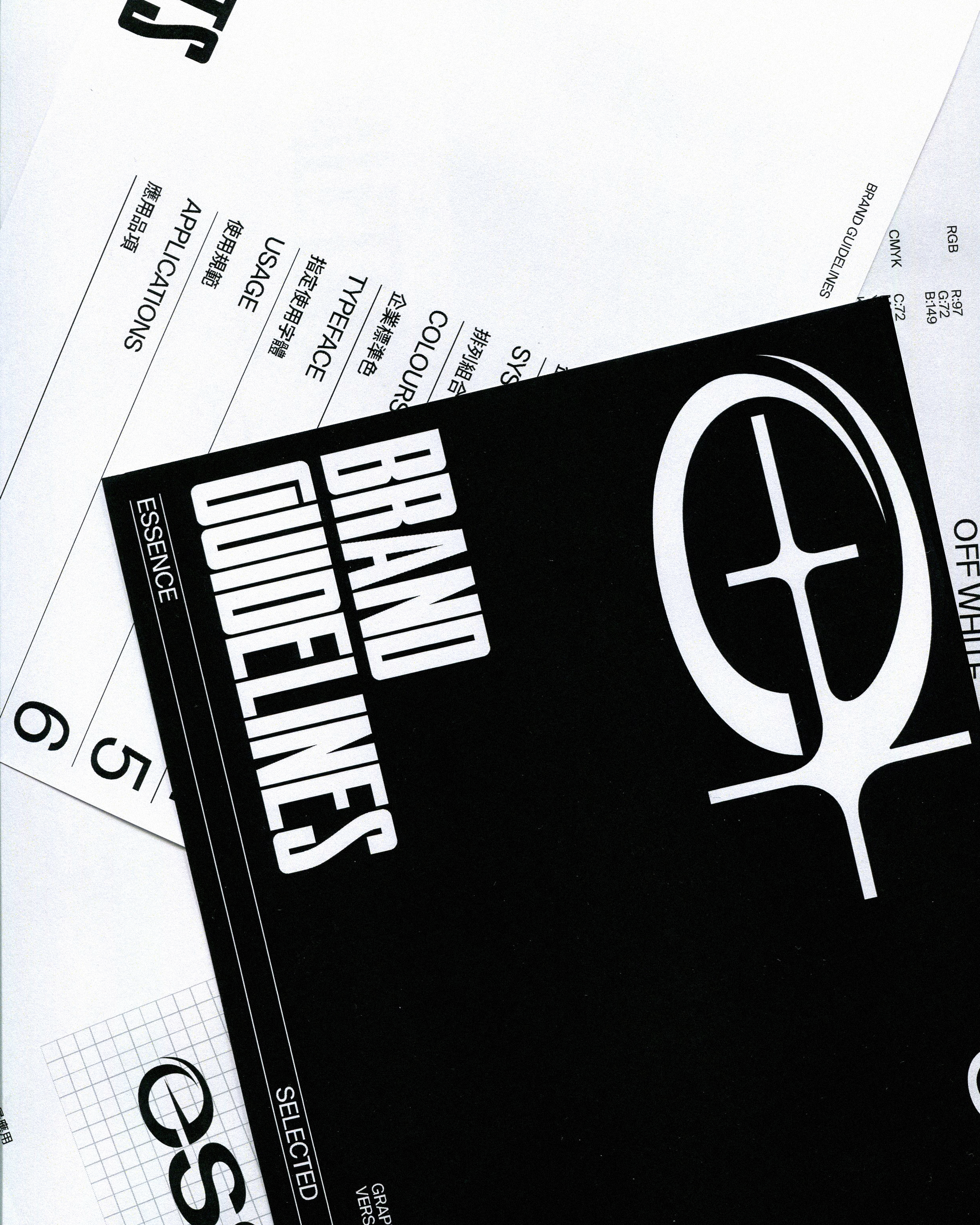
Brand Identity
Packaging
Typography
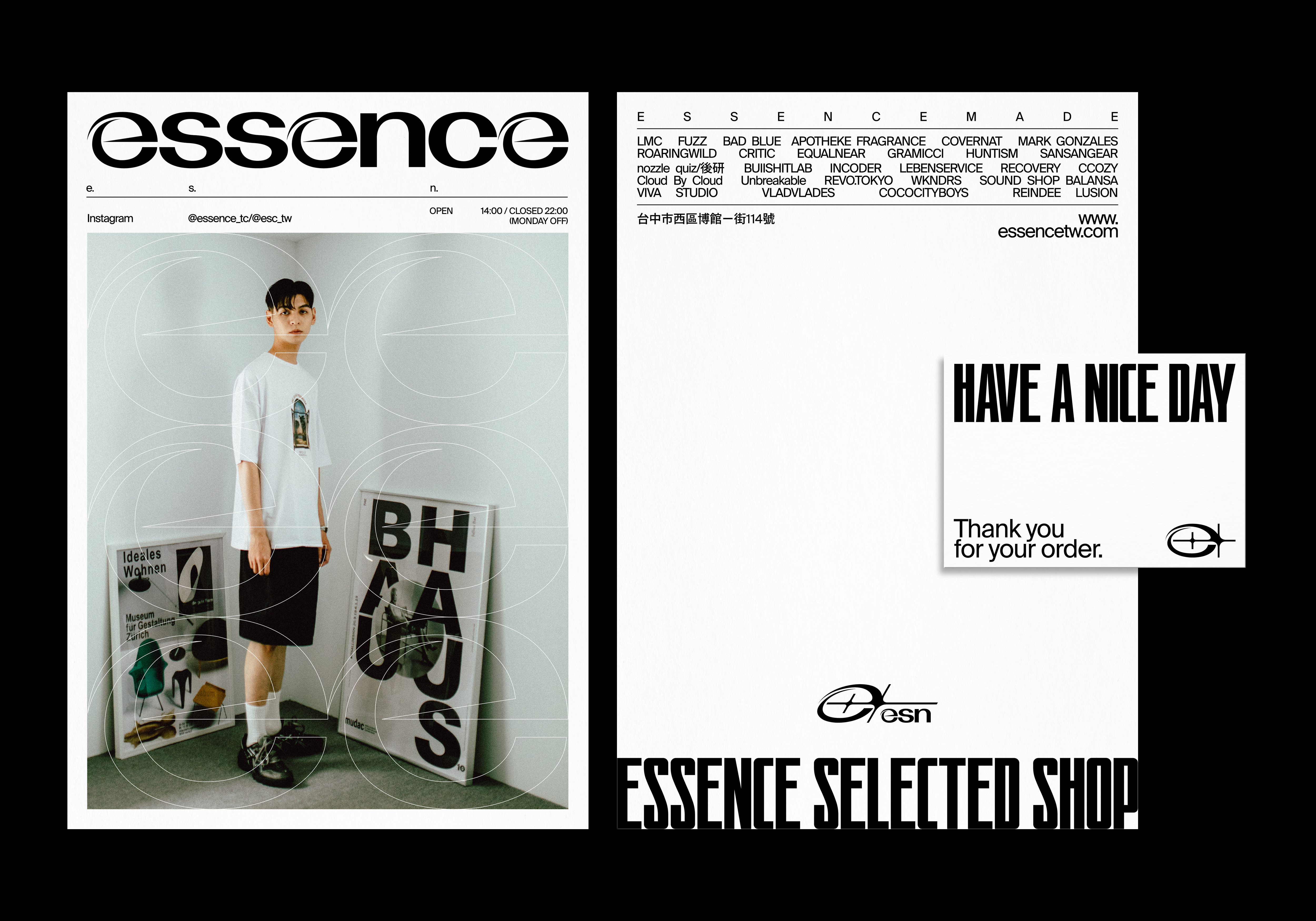
Essence is a selected shop located in the West District of Taichung City. It was an online store and established a brick-and-mortar store in 2020.
In addition to clothing selection, it also combines the coffee & light meal brand “THE CAFE”, bringing more different clothing options and experience into the city.
Essence is going to release its own-brand this year, and we were commissioned to create a new Brand Plan for clothing and other extensions in the future.
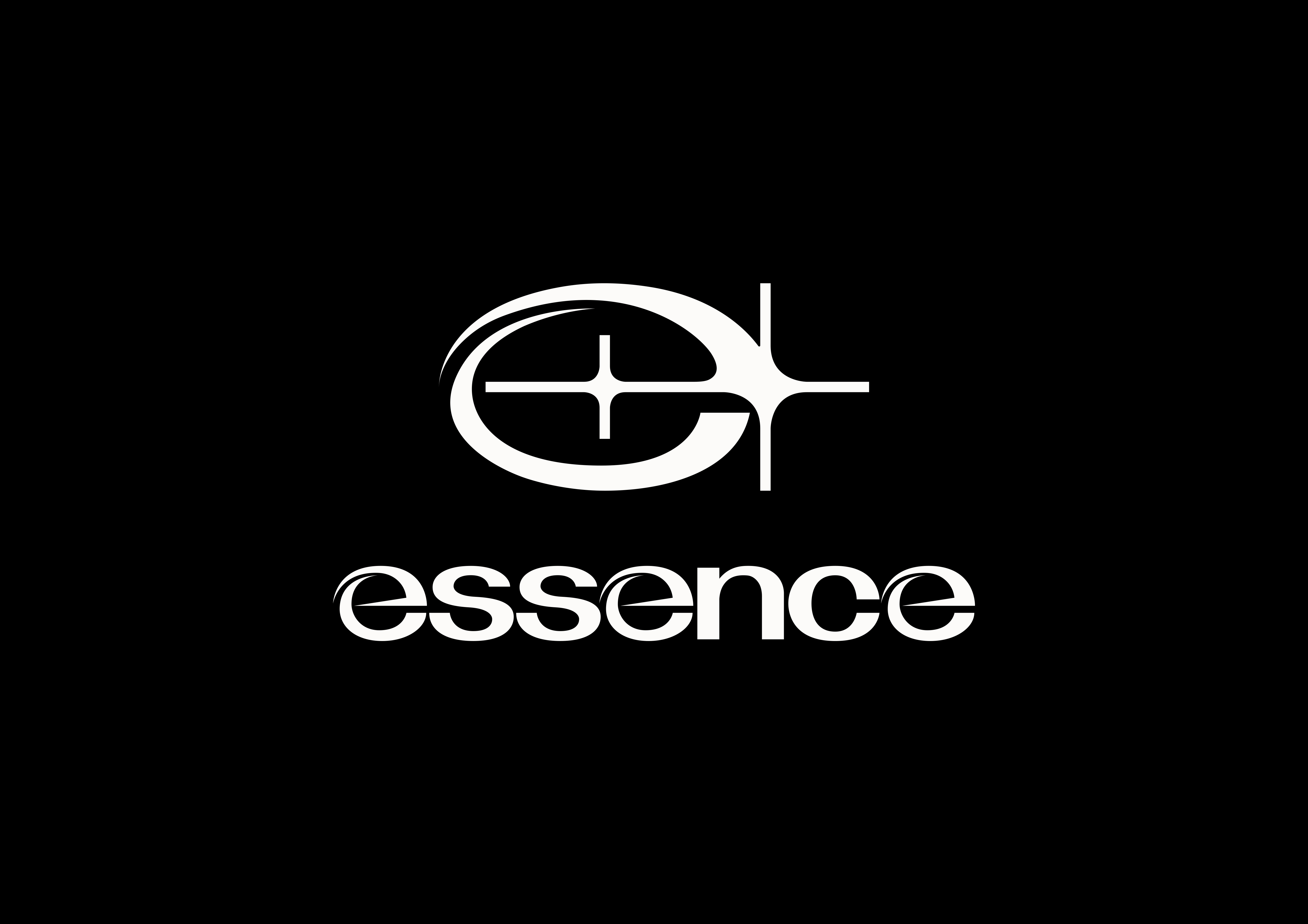
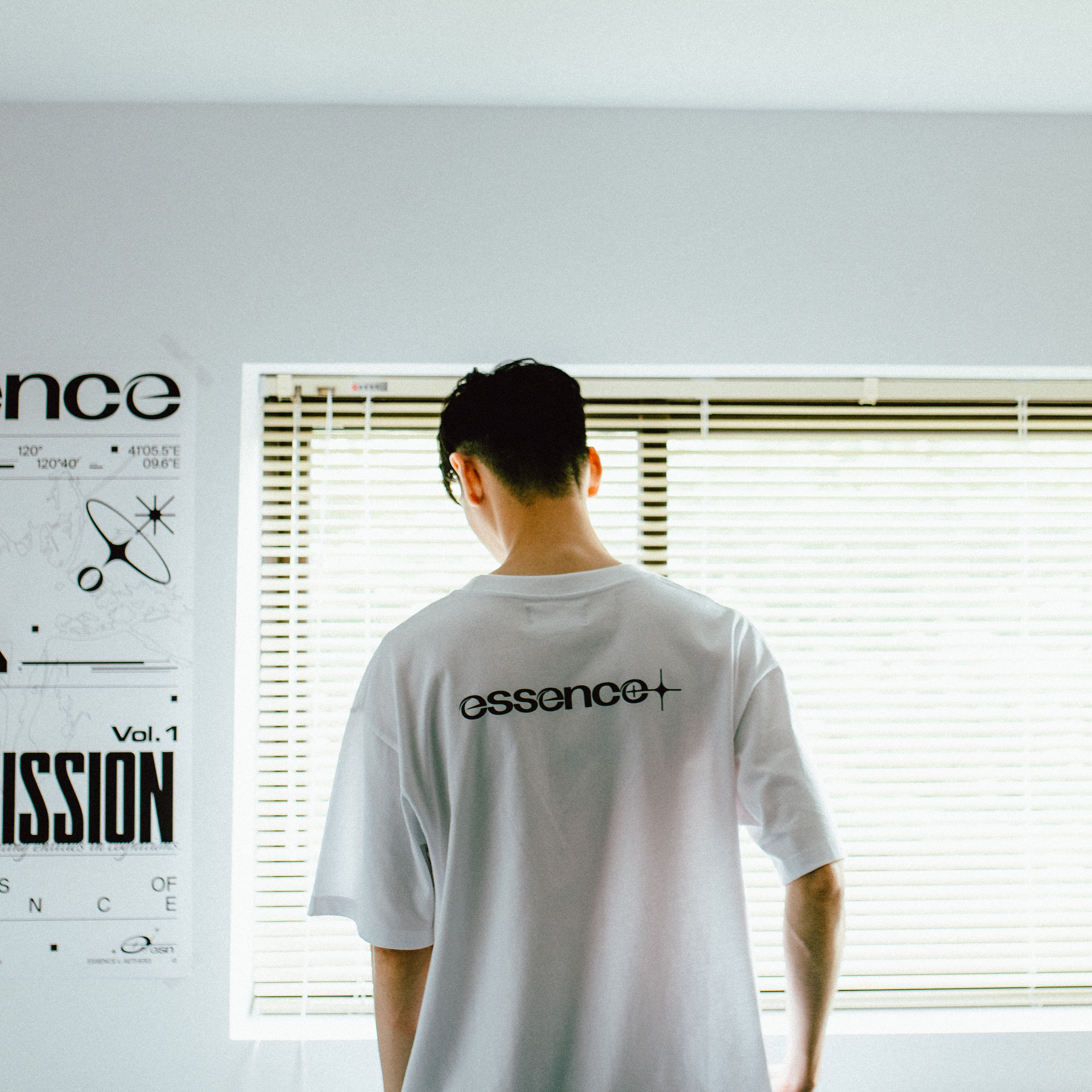
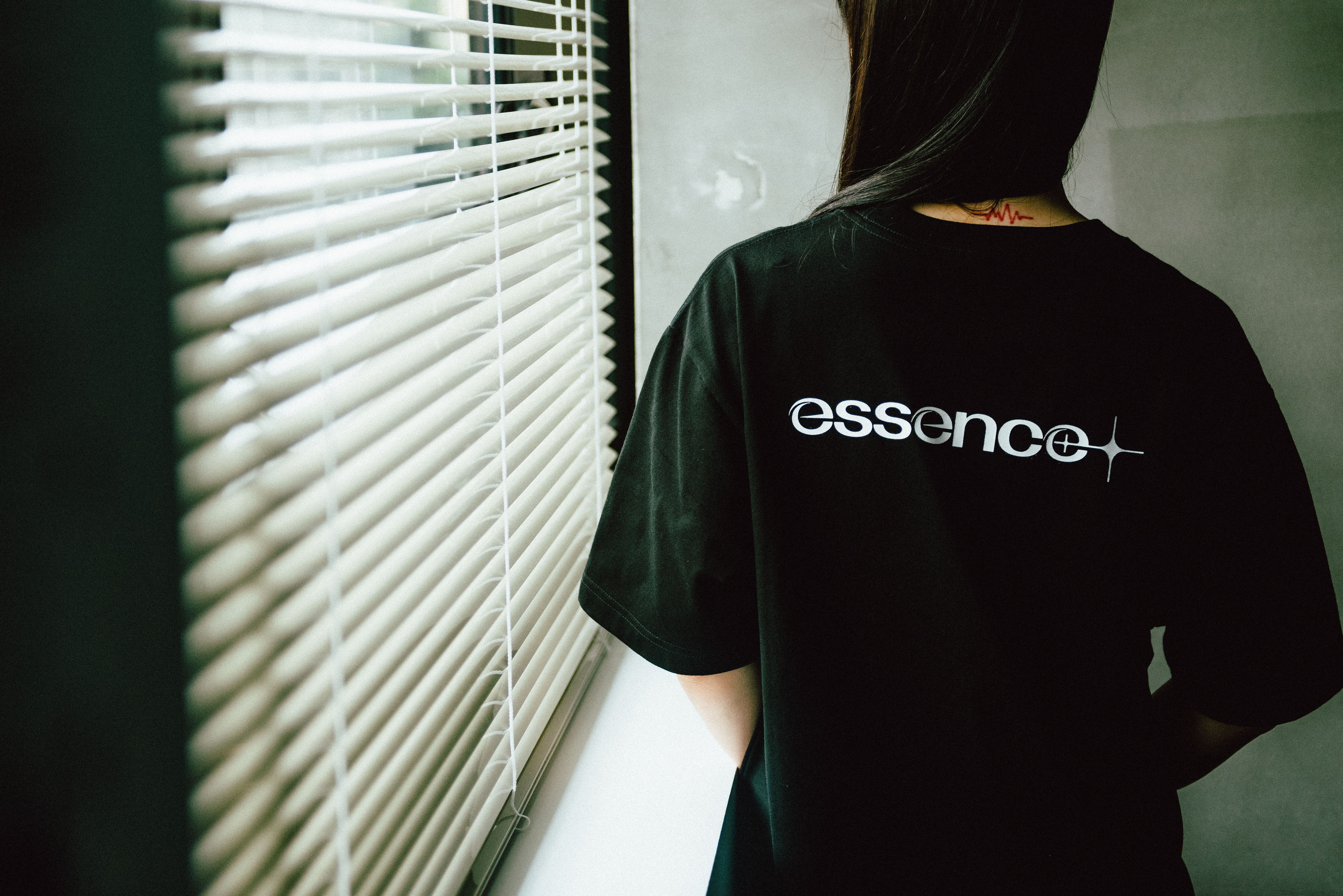
As a fresh start, we customized a bold, concise and eye-catching brand image for it. In terms of Logo, we used the most conspicuous “e” as the starting point, adding light, blending into the sense of shuttle, rhythm and surround; In terms of Logotype, it was also designed with the concept of Logo, the “e” of the brand name occupies three seats and divide the letter equally. We take “e” as the main eye-catching point, the rest of the fonts use customized heavy Grotesk. We focus on the balance of the font and the coordination of negative spaces to make the overall vision looks simple and definitive, also has a strong uniqueness.
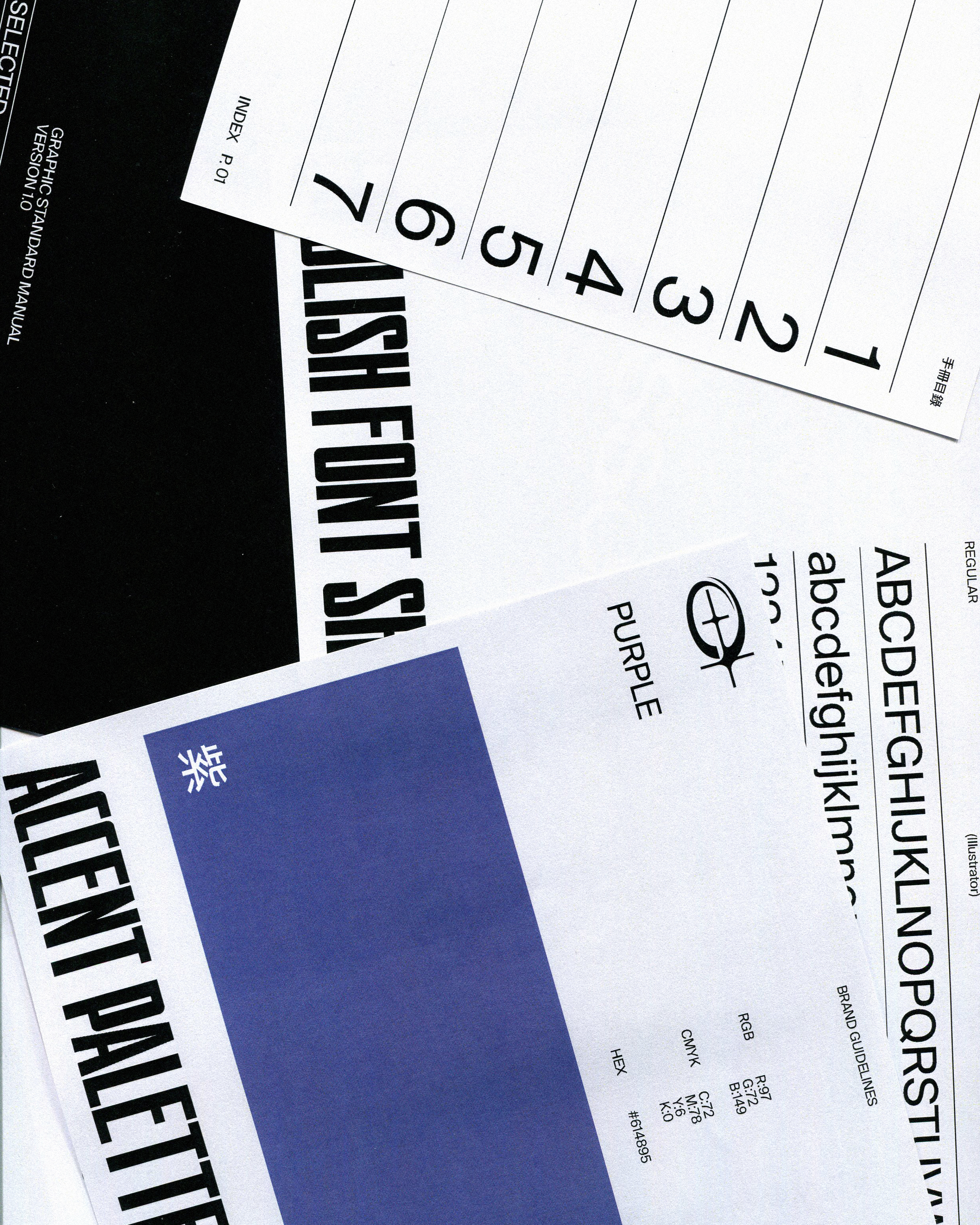
With two powerful visual identities, we have customized a neutral and modern typography system, choosing SKRAPPA as the Display typeface, SUISSE as the core text typeface, both typeface have steady visual effects and readability, which makes the visual identity and the layout complement each other.
In terms of Colors, besides the basic black and white, we also use purple as a secondary color to embellish and emphasize the brand positioning. Promoting the selections and life style of Essence by the overall visual plan.
(Photo by Edward Lee from Ledge Production)
essence為一間位於台中市西區的選物店鋪,其前身為線上商店,於2020年成立實體店面,除了服飾選物外也結合了咖啡輕食「THE CAFE」,將更多不同的服裝選擇及體驗帶入城市中。
於今年將推出自設品牌的essence,委託我們製作全新的品牌規劃,以應用於服裝及往後的其他延伸。作為一個全新的開始,我們訂製了一套大膽、簡潔且引人注目的品牌形象。在識別標誌上我們以最顯眼的"e"作為出發點,佐上了光芒,融入穿梭、韻律及環繞感;在標準字體上,同樣以識別標誌的概念製作,品牌名稱的"e"占了三個席位,且均分了字母,我們將"e"作為主要的吸睛點,其餘字體運用了客製的粗字重黑體字,我們著重於字體的平衡及負空間協調,使整體帶有簡潔俐落的觀感又具有強烈的獨特性。
擁有了兩項強而有力的的視覺識別,我們訂製了一套中性、具有現代感的排版系統,選用了SKRAPPA作為標題字體、SUISSE作為核心的排版字體,兩項字體都帶有穩健的視覺效果和辨識度,使視覺識別和版面相輔相成。
在配色上除了基本的黑白外,以紫色作為輔助色來點綴、增加品牌的定位。透過整體視覺規劃,增強essence所提倡的選物及生活風格。